TAF Urban
- Role
- Brand Designer
- Year
- 2026
- Industry
- Engineering
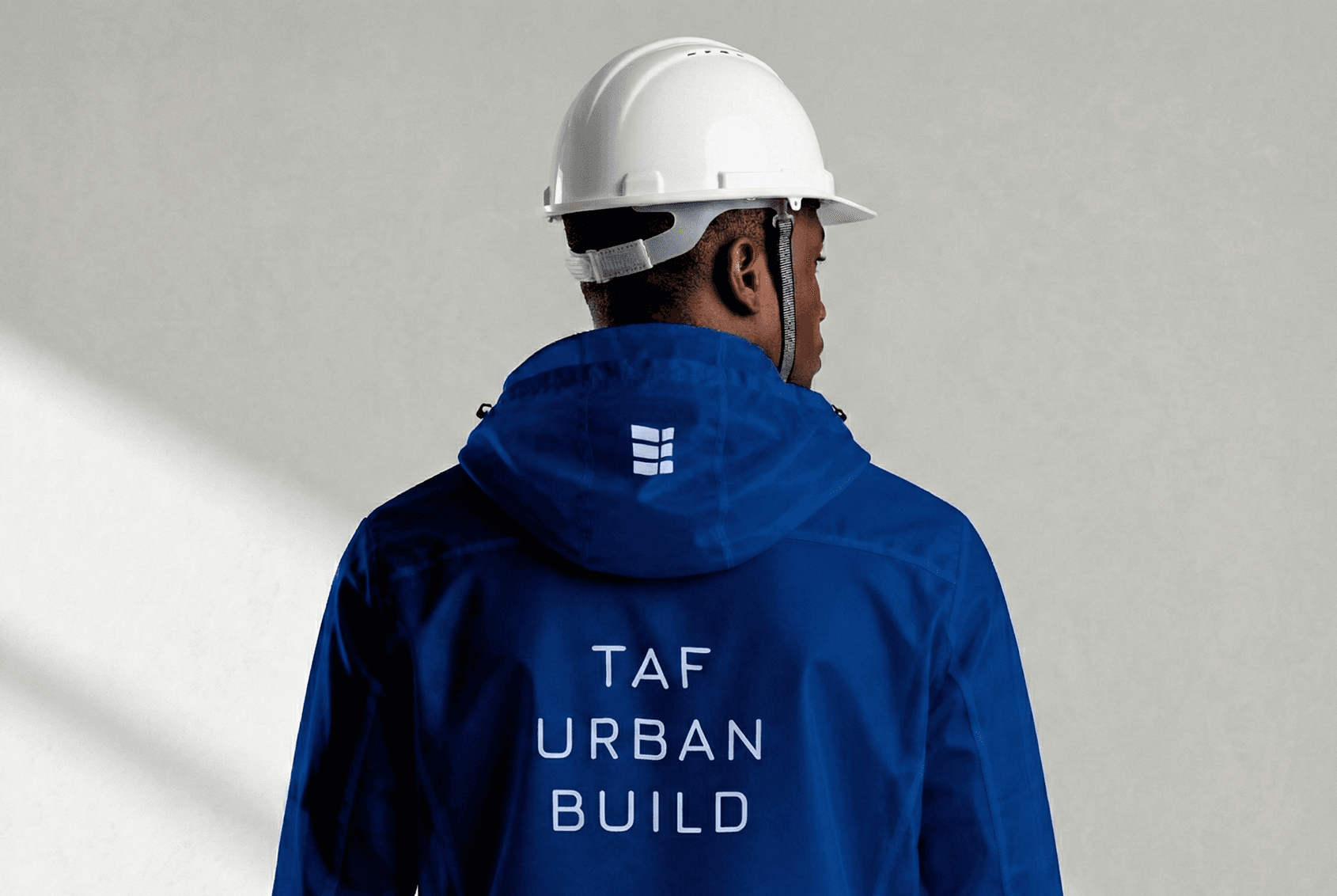
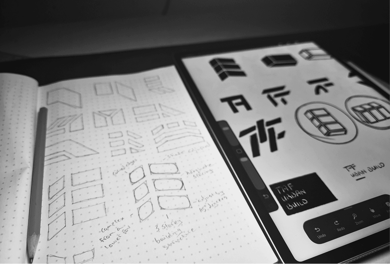
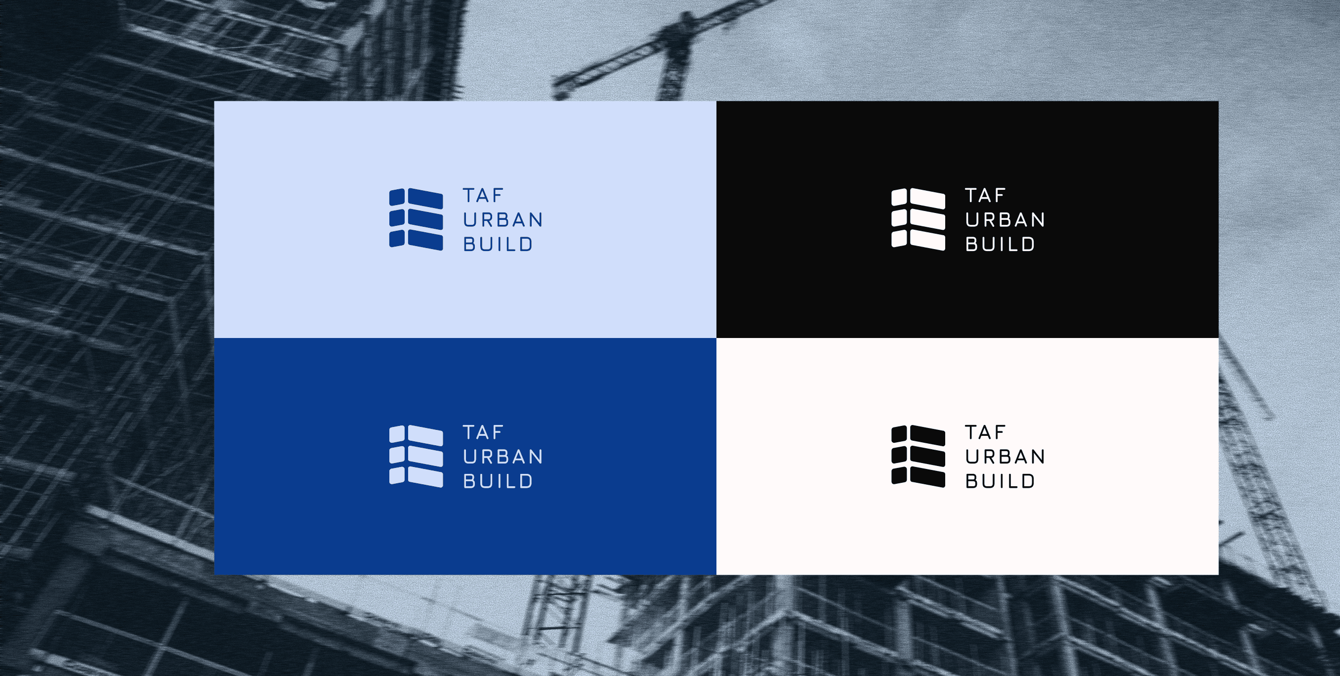
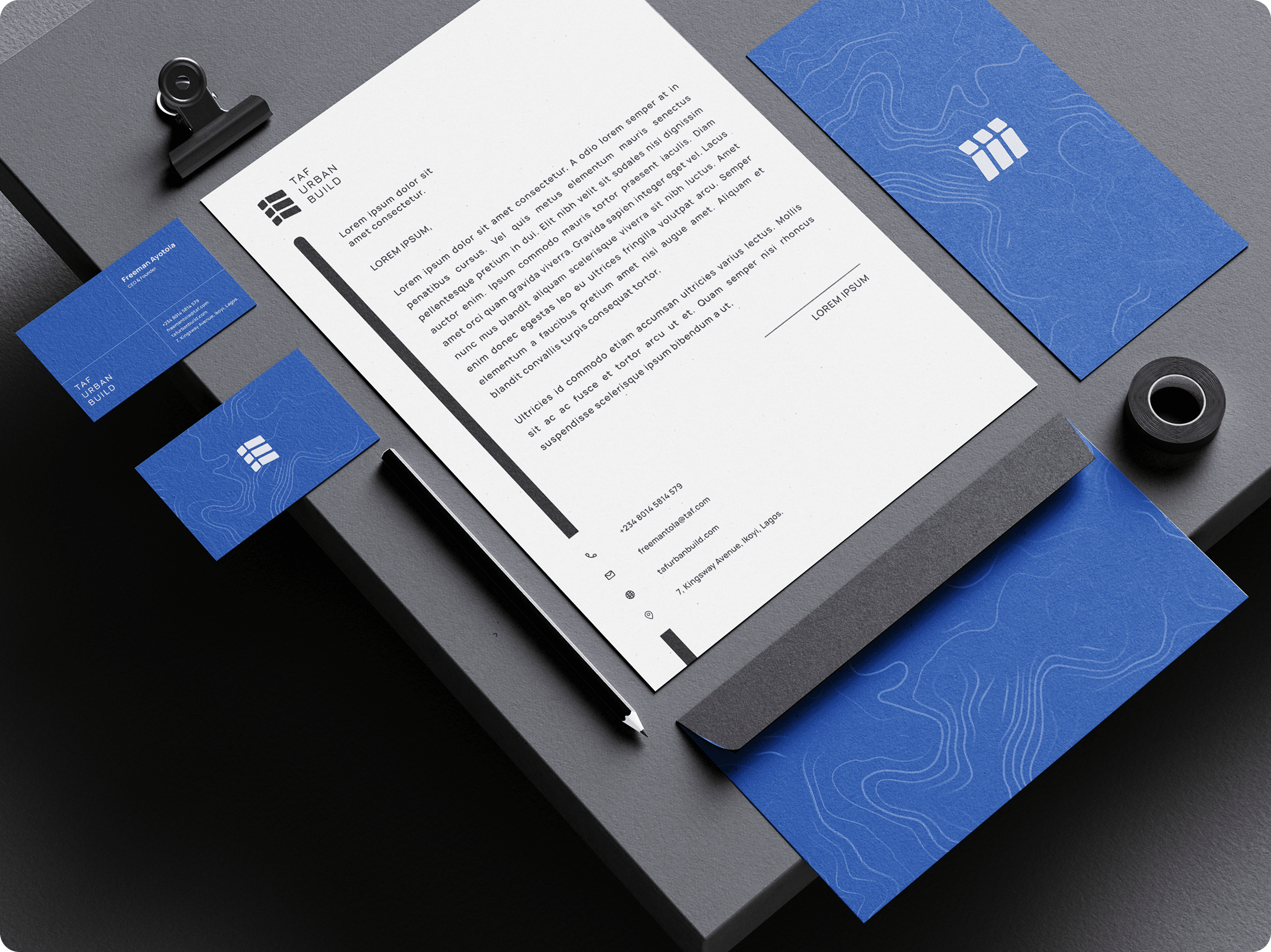
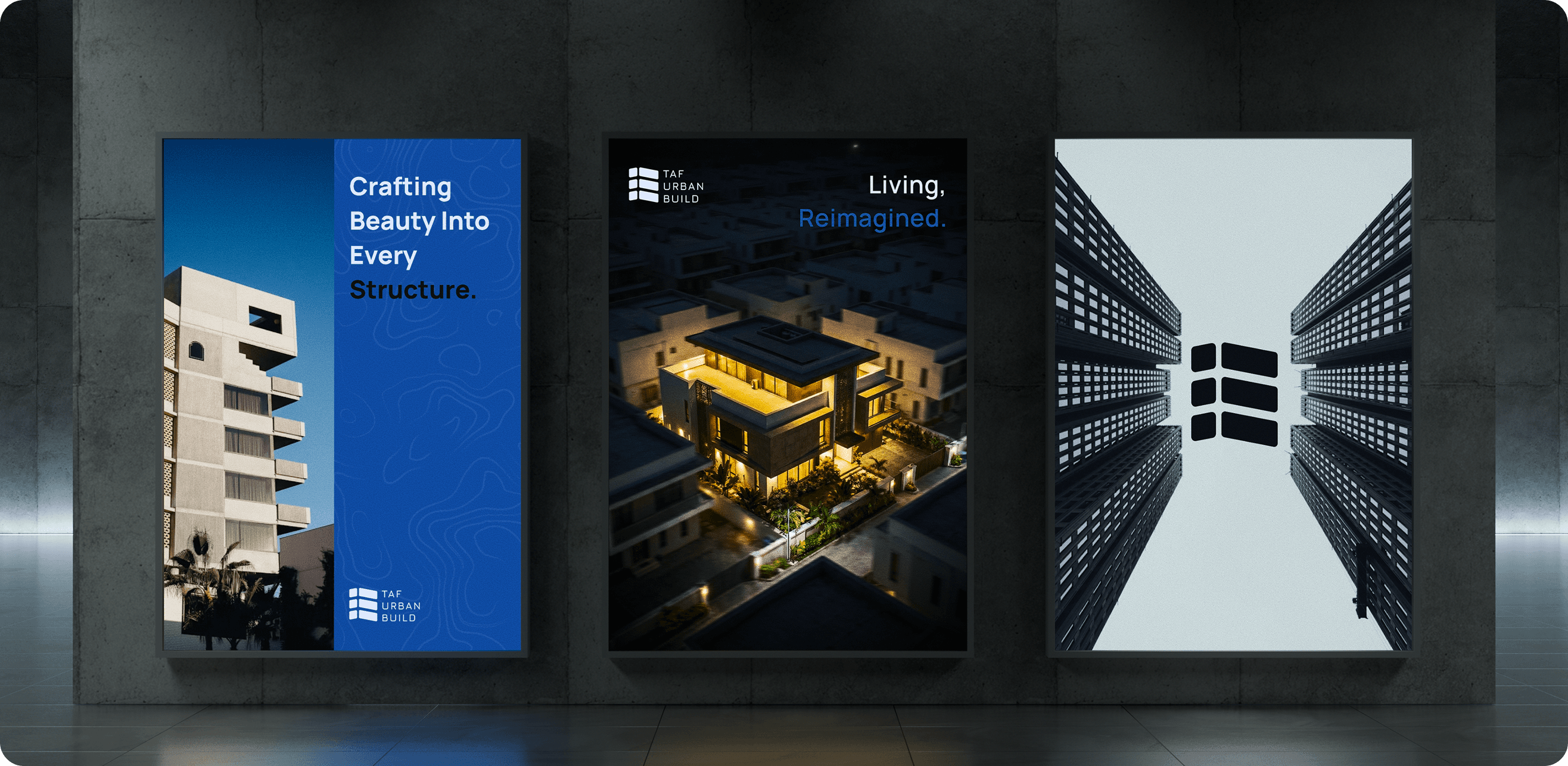
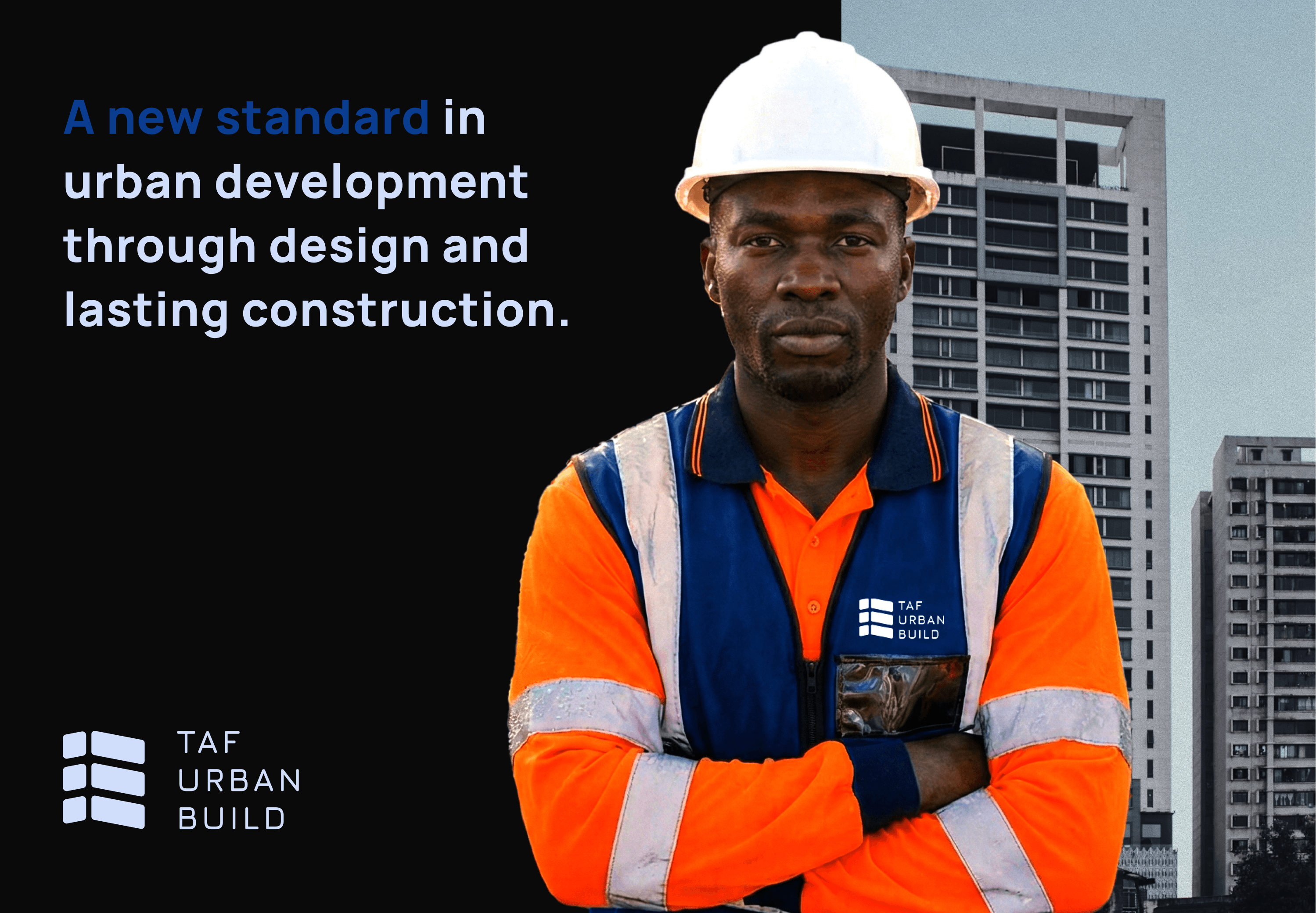
An identity as structured as the buildings it stands for: from a sketch of stacked floors to a system that survives a letterhead and a rain-soaked site jacket.
Problem
TAF is building a new standard in urban development. It needed an identity as structured as its work, one that holds up on a letterhead, a lightbox and the back of a site jacket: formal and rugged at once.
Design
The mark began on paper: stacked floor plates adjusted by 45 degrees, drawn from a three-storey structure, refined until three angled slabs read as both a building and forward motion. The secondary pattern traces the earth's topography, contour lines of the land TAF builds on, in deep construction blue.
Solution
A mark and pattern that work on envelopes, cards, campaign backgrounds, lightboxes and site wear, with guidelines so TAF can use them without me. I built a custom topography generator so the brand can produce a unique, in-depth pattern that reflects where its essence comes from.
Competitor Analysis
Competitors are primarily engineering, construction and architecture companies, so I created an identity with a distinct, sharp approach that stays accommodating.